2025
From ignored to essential

Rebuilding Workday Search with AI around user intent
Even Workday's CEO said, “Search is the most broken part of the product."
I was the AI UX lead across three interconnected workstreams: redesigning the filter system so users could actually find and use it, diagnosing and fixing a failing AI result card that almost nobody was clicking, and authoring the Know–Go–Do behavioural framework that became Workday's official findability standard.


But behind the launch, the experience was struggling. Users didn't trust it, didn't understand it, and often avoided it altogether.
The problem wasn't a lack of results.
It was a lack of clarity.
Users couldn't tell what the system was doing, what was relevant, or what they should do next — and trust quickly broke.
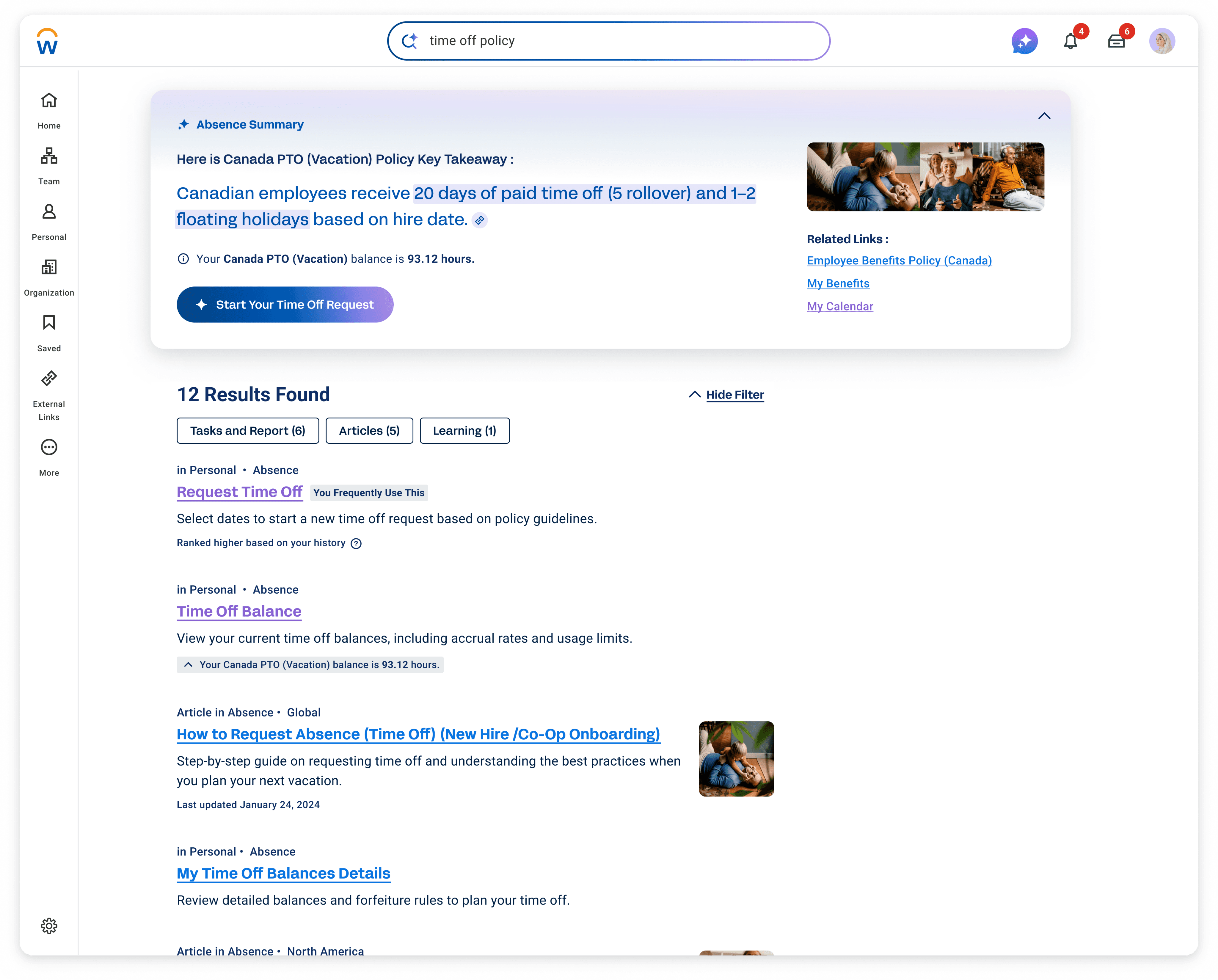
I introduced a structured AI framework grounded in user intent and real behaviour, helping people quickly understand, decide, and take action without needing to figure out the system.
That framework scaled across typeahead, ranking, and generative summaries — across a product used by over 70 million people. The results followed: top result click-through went from 7.5% to over 30%, average search time dropped from 36 seconds to 8, and 92% of users adopted the new experience.


How we started
My Role and Goals
As the UX Lead and a member of Workday’s AI UX Council, I was responsible for both delivering immediate improvements and defining how AI search would scale across the system.
Within a tight two-month window, I identified why users struggled with search through research and behavioural data, then designed targeted improvements for a critical AI-powered release.
At the same time, I defined reusable interaction patterns and a behavioural model that could scale across AI typeahead, ranking, and generative summaries, while aligning multiple product teams on a shared approach.
This work also contributed to Workday’s broader AI UX guidelines, ensuring consistency across teams building AI-powered experiences.
The System Constraints We Had to Work Within
System <> User needs mismatch
Legacy foundation → UX challenges
Workday is modernizing fast, but the foundation limits what’s possible.
Workday was built for HR experts, but over 80% of its users were not.
Workday began as a highly secure HRIS (human resource information system), designed for HR professionals, full of specialized terminology and complex processes.
As Workday scaled to over 70 million users worldwide, more than 80% of them were not HR experts. Users who didn’t speak the “Workday language” became the primary user base.
This mismatch between the system’s foundation and its modern user base sits at the heart of many UX challenges we faced, especially after I moved to the Search team.

search was a forgotten essential
83% of employees and managers told us they rarely or never used Search.
5 out of 6 employees and managers told us they rarely or never used Search. They try searching once or twice, but if they don’t find what they need immediately, they stop using it.
Many go straight to Google instead, because it feels faster, clearer, and more predictable.
For a surprising number of users, or maybe as expected, Google actually became the starting point of their Workday journey — before they even logged in.
To understand why users avoided search, we studied behaviour across interviews, analytics, and search performance.
11 user interviews
Behavioural analytics on search interactions (clicks, toggles, and task success rates, speed to enter task)
Data analysis comparing AI-powered results with traditional search results, focusing on result quality and user data.
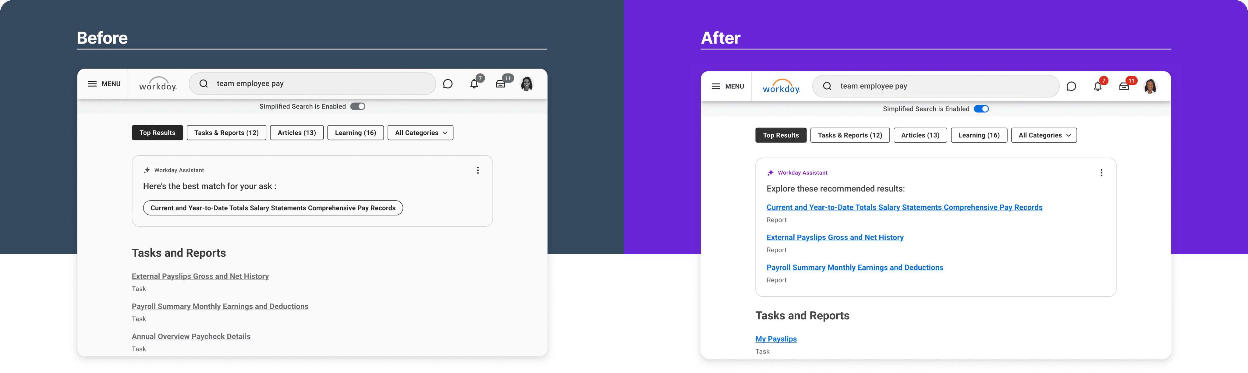
Old Workday Search (- 2024)

Across these methods, a consistent pattern emerged. Users couldn’t predict what would happen when interacting with search results:
3 patterns of why people don't use Workday search :

Avoidance
HR’s “thing” isn’t for most of the people


Disappointment
“Don’t know how these results are relevant to my search.”

Lack of trust
A few bad experiences is enough to break trust in Workday search.
After these few bad experiences, trust breaks.
Learn from what people love
“Search” = Google
Users weren’t struggling because search lacked results. They were struggling because the system didn’t match how they think when they search.
Almost everyone we interviewed directly compared Workday Search to Google — they expected it to be just as easy and intuitive.
This aligns with Jakob’s Law: users want new experiences to behave like the ones they already know.
What actually makes Google so good?
So I studied Google’s UX principles — not to copy Google, but to understand how they design for intent, clarity, and trust.

search intents simplified
know, go, or do?
One idea stood out right away — the Know, Go, Do framework.
It’s a simple but powerful model that simplifies user search intent into only three patterns. When users search, they're typically thinking, I want to Know something, I want to Go somewhere, or I want to Do something.
Understanding search this way helped me visualize user intent more clearly, and it matched how I naturally approach problems — visually and systematically.
It also gave me a chance to rethink Workday Search from the ground up, starting with its UX instead of its technical limits.
With Know, Go, Do
Defining the Findability AI System
I want to
know
Guidance
Needs
Efficiency
Needs
Action
Needs
I want to
go
Efficiency
Needs
Guidance Needs
Action
Needs
I want to
do
Action
Needs
Guidance Needs
Efficiency
Needs
As the Findability AI Lead, my role was to define how Workday search should behave as we introduced an AI layer into the experience.
I partnered closely with five product teams, along with engineering, research, and content strategy, to extend the Know–Go–Do framework across three core surfaces:
AI-powered typeahead
AI-informed ranking and search results
Generative summaries
I defined the behavioural model and translated it into interaction design, prototypes, and production-ready UI across these surfaces.
At the same time, I partnered with product and engineering to shape a multi-year Findability vision — mapping how search would evolve across Now, Next, and Future, while keeping the behavioural foundation consistent.
Know–Go–Do became the structural backbone of the experience. Even as AI capabilities evolved, the underlying logic remained stable.
This consistency allowed us to introduce new functionality without sacrificing clarity, enabling the system to scale over time while remaining predictable and easy to use.
But a framework only matters if it can be applied consistently across real workflows.
Here is the phase-by-phase breakdown of how I implemented this framework in real life:
Phase — 1
Identify High-Value Manager Workflows
To operationalize this at scale, I started with behavioural data.
Phase — 2
Subject matter experts interview world tour

Next, I partnered with designers who owned each workflow to map the four components of the Know–Go–Do model.
Phase — 3
Source of truth for cross functional use
From there, I captured the four key components in Airtable.

Findability for Workday Illuminate AI
Making Know Go Do for “HR thing” users
Workday’s Know-Go-Do Model Example
guidance needs
Know
Such as:
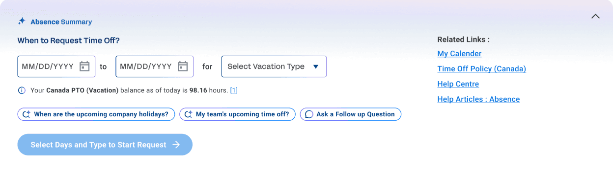
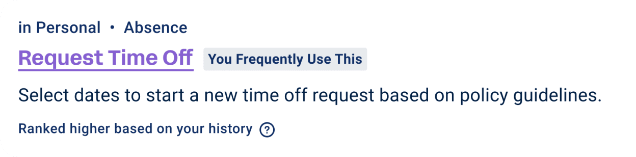
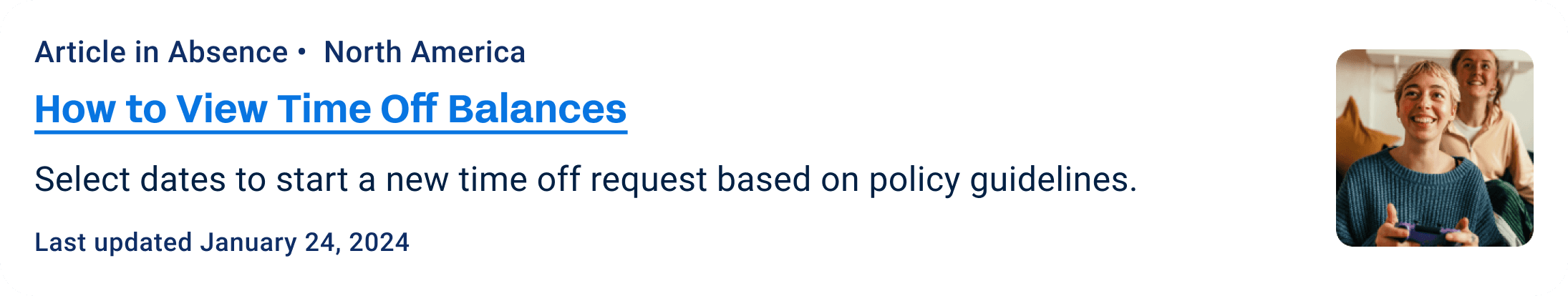
“How much time off do I have left this year?”
“How much tax did I contribute last month?”
“How do I start hiring?”
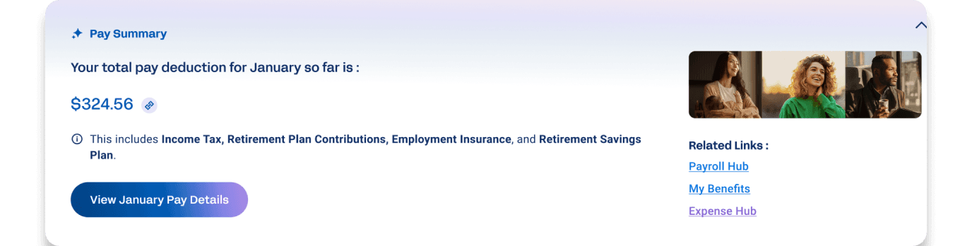
For Know Intent, system provides:
AI summary surfaces clear answers and supporting data that help users move toward “Do” (Action).
With the Glean AI integration, users can now ask follow-up questions right from the summary for deeper insight.
action needs
Do
Such as:
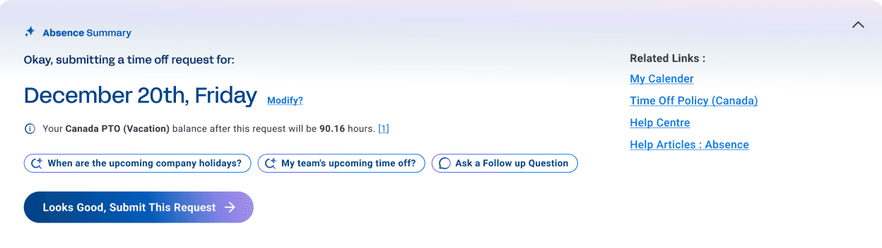
“Take next Friday off.”
“Submit my expense report.”
For Do Intent, system provides:
When the system detects a Do intent, the AI summary becomes the task entry point. Such as opens a date selector pre-filled with your time off balance, you just confirm, and the action completes.
Every element is designed to shorten the path from intent to “done”.
Efficiency needs
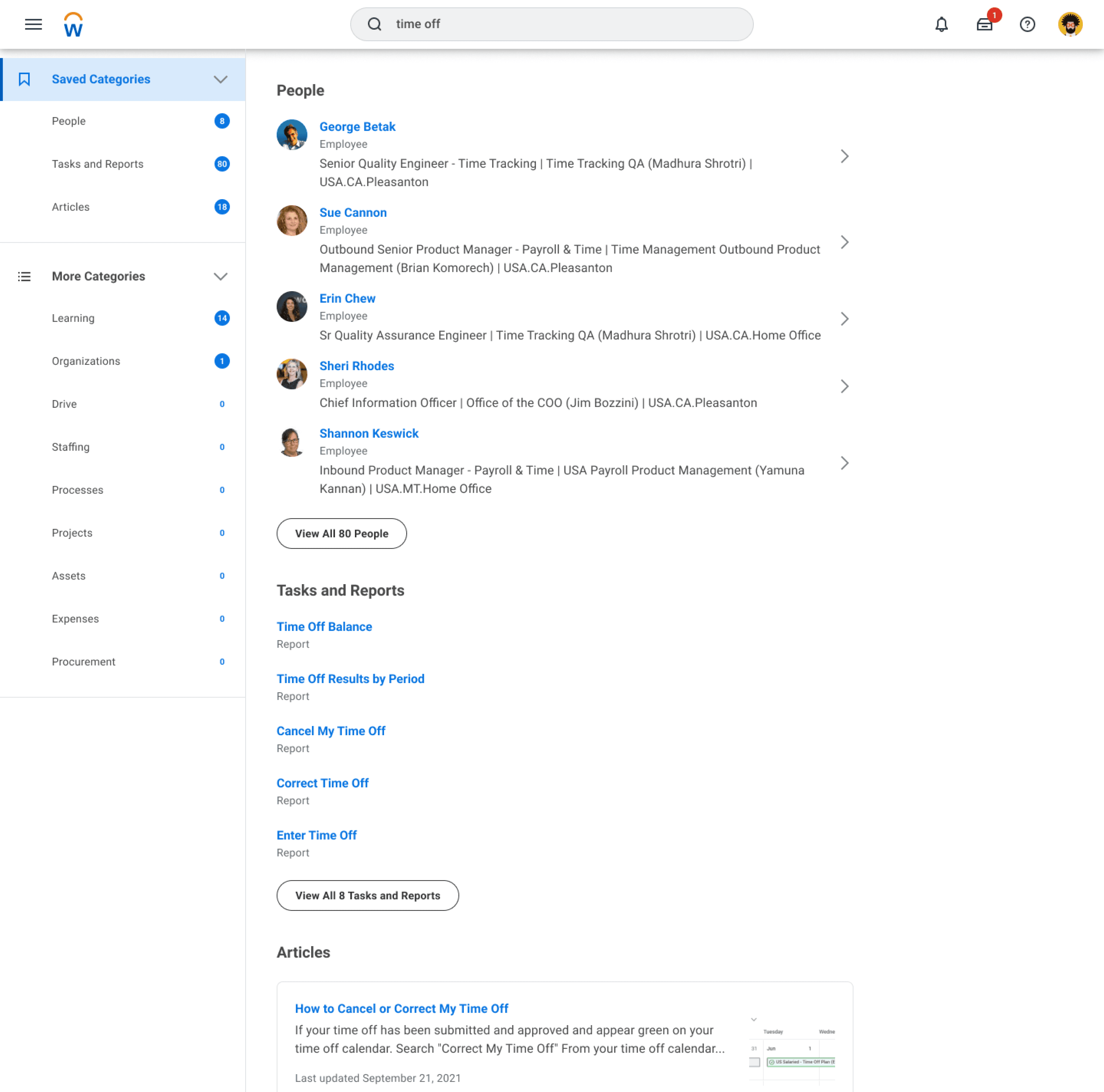
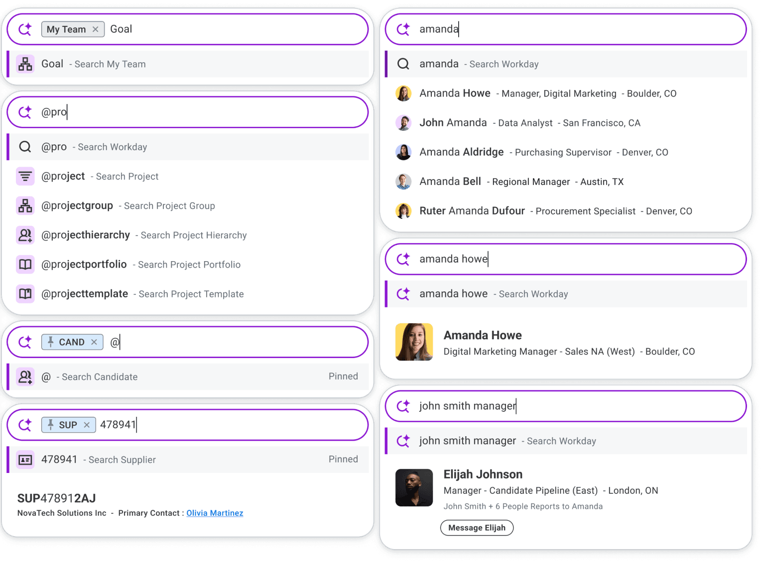
Go
Such as:
“inventory report#3657”
“Case ID 363”
“Candidate Henry Lam”
For Go Intent, system provides:
No summary appears.
The focus shifts to fast, relevant Typeahead suggestions or clearly listed search results so that users can quickly find exactly what they need.
Anything else is just noise.
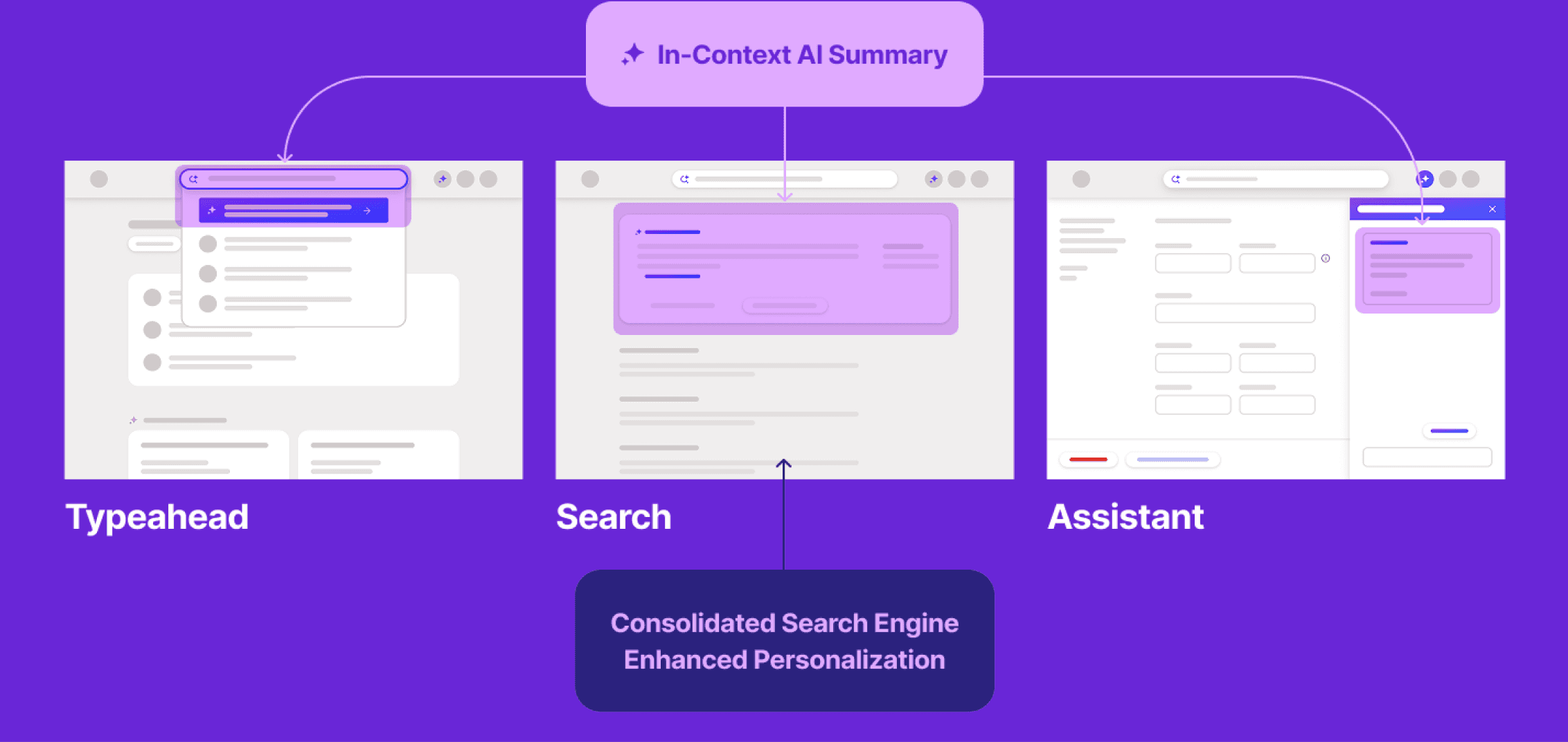
Here’s a high-level view of the new Workday Know–Go–Do model I created.
For Know needs, the goal is proactive clarity.
In typeahead, we surface an AI-powered summary as the top result. On the search page, we present a richer, personalized generative summary — giving users immediate context while still supporting a smooth handoff into action.
For Do needs, the goal is frictionless execution.
When intent is clear, AI prompts the right task entry point directly — or in some cases completes the task immediately — reducing unnecessary steps.
For Go needs, the goal is speed.
Users already know where they want to navigate. Anything extra becomes noise. So instead of summaries, the system focuses on fast, highly relevant results — personalized by usage, role, location, and metadata — helping users reach their destination with minimal effort.
To effectively meet both user needs for efficiency and contextual guidance, we envisioned a single, unified engine that could provide helpful summaries exactly when and how users needed them—not just in search, but across multiple touch points.
Before
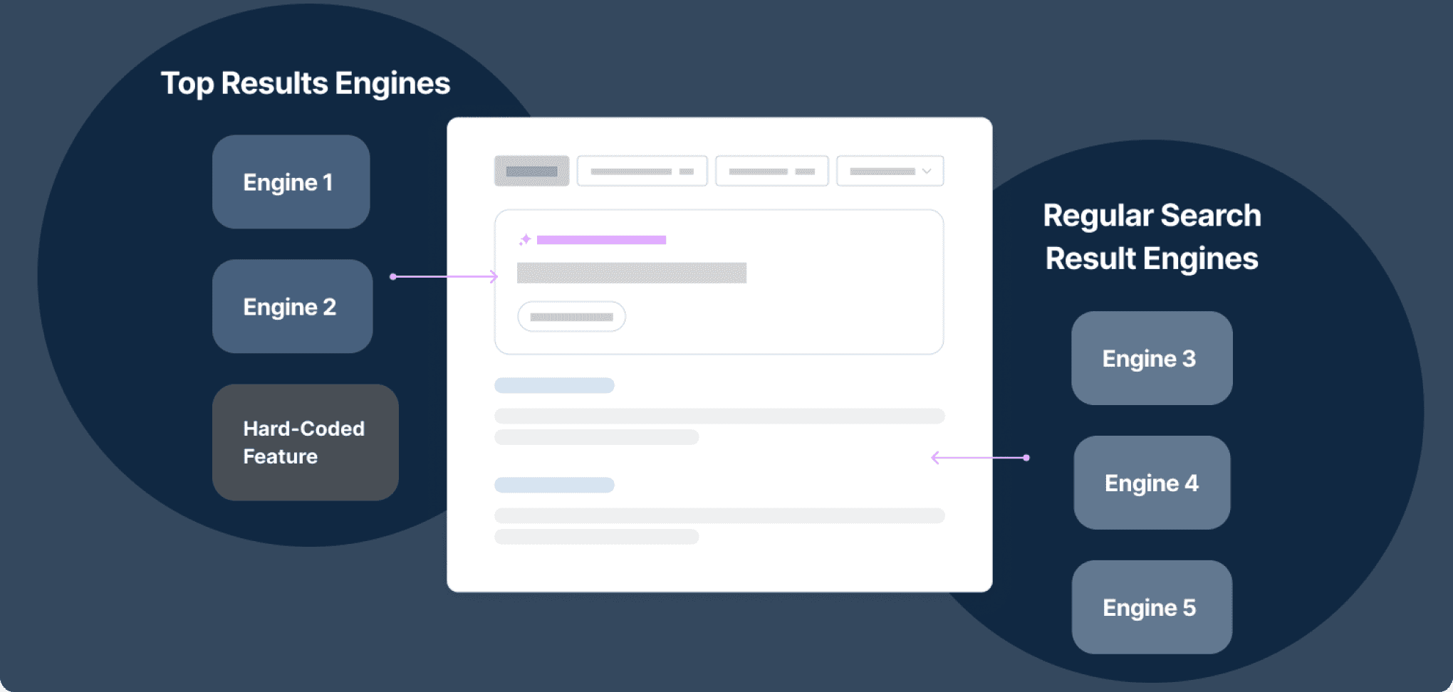
After
Five independent search engines operated in isolation, returning inconsistent results based on different definitions of relevance.
A single, unified engine designed to deliver relevant,
helpful content consistently across multiple touchpoints.
Note: Details simplified to protect confidential information.
Unified Framework
helps to move quick adding clarity
Even when I was asked to rescue our sister team’s AI feature, I relied on the same Know–Go–Do foundation.
The team had been experimenting with Retrieval AI, but click-through was only 7.5%, and ML latency was over 8 seconds. With the fall release approaching, leadership was concerned. I was brought in to diagnose the issue and improve the experience — and we had just three weeks.
Very quickly, I realized the problem wasn’t only technical. The system wasn’t wrong.
The interface was misrepresenting the intent.
2
1
3
1
2
3
1
More Content, More Choices
2
AI “Suggests”, Not “Decide”
3
Bring back blue links
1
Banner blindness
2
AI makes decisions on behalf of users
3
Buttons Slowed Users Down Lacking Context & Clarity
Problem:
Intent mismatch — When “Go” looked like “Do”
Trade-off:
Fix the foundation vs. ship AI quickly
Execution:
Aligning intent with interaction
Outcome
Clear improvement in understanding and engagement

content first
Creating Intent Frame for component framework
As we refined the model, the Content Strategist and I defined a clear structure for each type of intent — shaping how content appears so users can find what they need and take action quickly, without friction.
What the user is asking
What the system should answer first
What action should follow
And how the journey should continue
What content appears in the summary
What becomes a link
What becomes an action
What belongs in full search results

The final structure bundles: Know information, anticipated Do action, relevant Go destinations, and remaining search results — ordered by relevance and personalized by usage.
By designing the content frame alongside the intent model, I translated Know–Go–Do into a repeatable UI structure — essentially a behavioural blueprint for how AI responses and search results should appear.
This didn’t only shape the summary panel.
It also informed how results were labeled, ranked, and tagged — clarifying whether something was serving a Know, Go, or Do intent.
Every experience followed a consistent order:
High-value summary
personalized data
task shortcut
helpful links
full results
This structure defined the interaction logic.
First, clarify the answer,
Then personalize it.
Then enable action.
Then support navigation.
Because this pattern remained consistent across summaries, typeahead, and full results, the experience became easier to understand and more predictable.
Users could quickly see what the system presented and how to proceed.
That consistency became the foundation for scaling Findability in an AI context.
It helped us define when AI should explain, when it should guide, and when it should trigger action — without disrupting clarity.
Unified Framework
Designing AI search to help get “workday things” done fast
How much was deducted from the pay?


“take time off”
“take next Friday off”
These are some of the key components I delivered as part of the new Workday AI Search experience.
I designed the experience end-to-end — bringing together generative summaries, AI-powered typeahead, intent-driven ranking, intelligent filters, and contextual task entry points into one unified system.
From the hackathon in 2021 to this, the goal never changed: help 70 million users get their Workday things done faster.

meet New Workday AI Search
Actions in-context, Just straight answers
1
2
3
4
1
understands me
The system understands me, even if I don’t know Workday’s jargon.
2
Anticipates My Needs
The system shows me a summary card with clear next steps.
3
Personalizes For Me
It feels tailored specifically to my needs and my workflow.
4
Makes things Easier
The experience is organized, easy to understand, and saves me time.
My work concluded with delivering a new Workday Search experience — grounded in a behavioural framework that began as a small experiment, and now deeply embedded in Workday’s operating model.
This vision gave structure to fragmented systems. It unified backend engines, clarified ownership across teams, and created strong shared language across product, design, and ML.
It also established a stable foundation for AI to evolve responsibly.
Workday is complex. Users don’t come here for exploration or always exciting reasons. They come to complete tasks.
So I just wanted to make search genuinely helpful by listening to the pain points of the HR thing users — the mission stayed simple:
diginomica.com (December 13, 2024) : Transforming the enterprise user experience with AI by Katie Holden (VP of AI)
“Get Workday things done fast.”
That clarity became the anchor for every decision — not adding features for novelty, but defining clear behavioural rules that made the system more predictable and useful.
When AI was introduced, I designed the experience to follow that same principle. AI didn’t change the mission — it strengthened it.
Search at Workday evolved from simply retrieving links to guiding people toward the right action — and helping them complete tasks with confidence.
Working under pressure strengthened my discipline around clear, evidence-based communication, especially when influencing cross-functional stakeholders.
What stayed with me most from this experience is:
In complex systems, behavioural clarity scales.
When behaviour is predictable, trust increases — and adoption follows.
search now has a clear mission
“Get workday things done fast”
36s → 8s
Average search time reduced 4x
92%
New search Adoption
14%+
Improved Findability in 3 months
30%+
Time Saved for Manager Approvals
8s → <1s
ML Latency dropped
7.5% → ~30%+
Top Results CTR (EA)
8% → 22%
Search Filter Usage Increased